
Apex Legends
An award winning, free-to-play battle royale game developed by Respawn Entertainment. Set in the sci-fi universe of Titanfall, master its squad-based gameplay, hero-driven mechanics, and fast-paced movement system.
I’ve worked on Apex Legends from Season 7 to Season 25 during which I’ve designed, implemented, reworked and improved several of the core features that distinguish this game from its competitors. Below is a sampling of my favorite and most impactful work.
Legends
Newcastle
Season 13
HUD, Diegetic, Atomic
Newcastle is a defensive support Legend whose abilities interact with existing gameplay elements as well as introducing new ones.
The familiar
Newcastle's passive ability centers around his knockdown shield which he and only he can use to protect fallen teammates. As such, it was our tasks as designers to provide the player with passive and active information on the knockdown shield.
In use, the shield can be damaged by enemy players. To show that happening we attached an atomic element to the revival progress bar.
While not being used, Newcastle's knockdown shield passively regenerates. To inform the player of this we added an icon near their nameplate that has 2 states: a fully filled state and a regenerating state. In the passive state, the element is more concise, and shows the tier of the shield through its coloring. In the regenerating state the element is a scaled up and has additional percentage text and a progress fill on the perimeter of the shape both showing the player that their shields are regenerating and the current progress of it.
The New
Newcastle's ultimate allows him to jump to a teammate's within range's position and place a defensive wall in front of them. This is represented in gameplay by him lowering his visor to scan for teammates before performing an epic leap. These kind of signature moves are essential to a legend's essence and we want to reinforce it whenever we can. So in this case, we have a Diegetic HUD and in world VFXs to make it look like the lowered visor and the AR elements that would come with it.


Catalyst
Season 15
Minimal, Diegetic, components
As a defensive controller, Catalyst’s abilities are designed to reshape battlefield dynamics through barriers and visibility control. Her identity as a terraformer is well-integrated into her ability design and aesthetics.
Less is more
Sometimes it is important to understand what information is necessary to give to the user and when to give it. Catalyst is a good example of that.
Her HUD/UI is minimal because her abilities are simple, binary and visually self explanatory. We focused on visual, in world feedback.
Reinforced doors from her passive show clear ferrofluid coverage, spikes from her tactical glow and animate when triggered, and her ultimate "The Dark Veil" creates a massive visible wall that can't be missed.
The player doesn't need meters, stacks, or tracking widgets. We leaned into a clean design that keeps her gameplay intuitive and immersive.
For the UI, we kept it to the existing and general button hints that any player or character would get when they are looking at something they can interact with.


Alter
Season 21
HUD, Diegetic, Bespoke
As a mobility-based controller, Alter is built for territory control through mobility disruption rather than static defense. With a focus on portal manipulation, spatial unpredictability, and enemy disorientation, her abilities support creative flanking, team repositioning, and escape, appealing to players who enjoy map manipulation and misdirection. With a kit that works best with team interaction, Alter is a UI heavy legend that needs fast and precise feedback on her abilities to allow for optimal decision making.
Avoiding Information Overload
Alter is a very technical legend. Her portal ability introduced a brand new way to traverse terrain and her Ultimate allows for instant full team repositioning. In Apex Legends positioning is everything and both of these abilities can be very punishing if miss-used. As such, it was necessary to include as much information as possible for the user whilst also avoiding overloading them with it.
For the tactical, information on the states of the entrance and exit portals as well as the distance you'll travel is shared. In previous iterations there were scans of the location at the portal exit, shared portal timer, constant on screen reminder of portal location and distance, information of if the portals were used. Some of this extra functionality we've hidden behind upgrades, giving the player the time to get used to the basic working of the ability and giving them an expectation for more info so that they're not overwhelmed when it appears. For some other we just fully scrapped it, both for gameplay and UX purposes.
For the Ultimate, we also started with providing the player way too much info. Constant UI element on screen while the ult is active, info on all teammates and their interactions with the ultimate. That proved too distracting for players. We toned it down a lot, showing minimal action hints when the ult is out and adding extra details only when looking directly at the ult by attaching in world billboarding elements to it.
Reinforcing a vibe
Before Alter's appearance, Apex Legends had already laid groundwork for alternate dimensions through Wraith's backstory in seasons 1 and 2 and Horizon's story in season 7. Alter was coming in with stronger lore relevance and connections than some other Legends and was the main event of Season 21. As such we wanted her arrival to be felt and celebrated.
The season and Alter's overall visual theme being the "Fractured Reality" aesthetic, Alter’s entire visual and UI identity centers on distortion, refraction, and void fractals: visual cues that evoke dimensional instability. We reinforced that through her color palette (Deep violets, electric blues, and magenta highlights), UI Motifs (Triangular shards, ripple distortions, and broken glass motifs), and Typography & Framing (Her menus and banners use angular, asymmetric borders and negative space “tears”).
In this instance we prioritized a vibe and signature look and thus created bespoke elements to be used exclusively by Alter. This went against our usual practice of creating UI that is atomic and can be reused and repurposed in the future.


Lifeline revived
Season 23
HUD, Atomic, rework
Lifeline is a combat-medic who’s abilities embody a clean, support-centered design focused on healing automation, team sustainment, and low-friction revival, making her one of the most approachable and functionally clear Legends.
In season 23 Lifeline got a major kit overhaul reworked so that she fits more as a support-combat hybrid rather than just a stationary healer.
The Rework
An important focus of any rework is to have clear UX for both new and experienced players that can be understood intuitively. Lifeline's rework had D.O.C her robot companion play a major role with all of her abilities.
First and foremost being her tactical. D.O.C used to just be summoned as a stationary healing machine that would heal any friendly heroes near it. In the redesign D.O.C could now be assigned to Lifeline or an ally and would follow them while healing them. This is considered a "deployment" of D.O.C and for players to recognize that easily we opted to use the expanding tactical UI we use for Crypto and Vantage for when they deploy their Drone and Companion. UI having a specific use is indispensable, it trains your players to recognize a specific functionality and allow for a seamless introduction of a new mechanic.
Lifeline's Ult on the other hand didn't just get new behavior but instead was completely reworked. Originally she called down a care package that would provide some upgraded and useful loot for her team, now it created a shielded area that provides cover while also speeding up the use of health and shield consumables for players inside. Consumable usage already had UI and so the focus here was to create a new "enhanced" state for it. While designing this there was talk of enhancing the healing in a different way for the next season. We thus focus on 3 modular variables we could use alter in the UI to show a multitude of different states.
Those 3 variables being Color, Progress Bar look and Additional decorations.
The Color is used to recognize the source of the enhancement, showing Lifeline's teal color for her speed boost but the support class' blue for enhance healing due to being a support legend.
The progress bar to reinforce the effect look to include additional arrows to imply speed or and additional expanding section to imply additional healing.
The decorations, art element added to the sides for even more details on source and effect.


sparrow
Season 25
HUD, In-world, Atomic
Sparrow is the latest legend to have been added to the game and my final legend work on Apex Legends. His abilities boast a design that emphasizes agile mobility, precision tracking, and area control.
the sum of effort and planning
Building Sparrow’s UI came naturally after years of refining Apex Legends’ systems. Since Season 7, I’ve developed modular, atomic components that streamlined new legend integrations—each piece designed to enhance existing gameplay features. This foundation made Sparrow’s interface quick to prototype and implement, freeing time for a stronger visual polish and a cohesive art pass that reinforced the legend’s identity.


Updates and improvements

Mad maggie
Season 12

ballistic
Season 17

Revenant Reborn
Season 18

ash
Season 24
Modes
Mixtape
Gun Run
Season 14
Screen, hud, system, Atomic
Gun Run in Apex Legends: Mixtape Mode is a fast-paced, team-based mode focused on weapon progression and continuous combat flow, designed to keep players engaged and moving without downtime. It was important from a UX standpoint that players be able to tell how they were doing at a glance as well as understand their current situation in relation to their squad. It was also the first mode to introduce fighting between 4 squads and had to introduce a whole new way of tracking the enemies.
Micro and Macro state of the game
For Gun Run’s HUD, I designed the top bar to communicate the macro state of the match—showing each squad’s progress and the clear path to victory.
On the right side of the screen sits a streamlined UI widget that tracks the player’s immediate gameplay state and squad role. It displays the upcoming 2 weapons and if that means you're leading for the squad or trailing behind. This element ensures at-a-glance clarity of “what I need to do right now” and “where I stand in my team’s effort,” enabling rapid decision-making during the fast-paced flow of the mode.
rebuilding the foundations
Following Control, which introduced alliance-based matches, Gun Run expanded gameplay to four squads of three. Rebuilding the start flow for each mode proved unsustainable, so I redesigned it into a modular, screen-based system where panels could be arranged dynamically to fit each mode’s needs. This flexible framework standardized key pre-match moments—mode overview, lobby player info, squad showcase, and rival highlights (MVPs of other squads)—while enabling faster iteration and consistent presentation across future modes.


Team deathmatch
Season 16
Screen, modular, system
Team Deathmatch in the Mixtape playlist offers a fast-paced, no-friction combat experience, designed for players who want pure gunplay, quick respawns, and minimal downtime—ideal for practice, warm-up, or casual competitive fun.
Going back to a start flow closer to CONTROL TDM was our 3rd new mode that was added to give players options outside of ranked. It is the popularity of these new modes that lead to the creation of mix tape where we’d bring them back in a rotation for players to enjoy.
Got Lemons, make lemonade
The new modular start flow made it easy to prototype and iterate on new modes. This flexibility enabled the rapid creation of Team Deathmatch, designed as a middle ground between Control and Gun Run after player feedback called for a combat-focused mode without objectives. The success and popularity of these three experiences ultimately led to Mixtape, a permanent rotating playlist that kept the game’s most engaging modes in continuous play.


Limited Time Modes - LTMs
Revenant uprising
Season 19
Screen, hud, system, Bespoke
In the Revenant Uprising mode, the game introduced a striking asymmetry by pitting 30 “Legends” against 30 members of the Revenant Army — each with entirely different abilities, pace, and objectives. The event transformed the familiar arena into a takeover-scene where death meant conversion, dramatically shifting momentum and forcing players to adapt on-the-fly.
Lore directed user experience
Season 19 marked the culmination of Revenant’s long-running narrative arc, as his rebellion against Hammond Robotics erupted into the Uprising event. From a UX perspective, this moment demanded clear thematic integration across UI and gameplay, ensuring the event’s interface reflected Revenant’s takeover—visually distorting familiar systems while maintaining usability. This balance between narrative immersion and functional clarity helped anchor players in the chaos of the event without sacrificing readability or flow.
asymetric mode
Designing the UI for this mode introduced unique challenges due to its asymmetric gameplay. With two opposing sides—Legends and Revenant Army—sharing the same limited screen space, every HUD element had to adapt contextually while maintaining clarity under chaotic conditions. This required modular components capable of reflecting each team’s objectives, status, and abilities without visual overload.
This asymmetry also extended to character select, where half the lobby followed the standard legend selection flow while the other half were automatically assigned as Revenants. To support this, the screen needed to clearly communicate role and objective before the match began. I designed contextual messaging and visual cues that informed Revenant players they’d spawn as a special variant, ensuring both sides understood their purpose and expectations from the outset.


Arenas revival
Season 25
Screen, menus, hud, Rework
After its removal in Season 15 due to declining engagement, Arenas returns as a LTM with several updates aimed at enhancing gameplay and addressing previous shortcomings. UX wise the biggest changes were to the store where a whole UI overhaul happened to consolidate the several states and behaviors.
a 2nd chance
In live development, time rarely allows for addressing design or tech debt, which makes building modular, scalable systems essential.
With the return of arenas, the mode gets a 2nd chance (and the design team a 1st) at reworking the round buy shop menu. The original implementation lacked visual consistency and clear states across weapons, ordnance, and gear. Our redesign focused on establishing a cohesive, readable system of states that clearly communicated what players could afford, what carried over or was gifted from previous rounds, and what was discounted that match—ensuring clarity and speed in a highly time-sensitive pre-round flow.
1 v 1
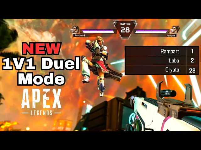
The launch of the 1-v-1 variant in Apex Legends’s Season 25 was executed under extreme time constraints, forcing the team to leverage existing systems and rapidly iterate from prototype to live mode in a matter of weeks. Simultaneously, we designed a clear, real-time leaderboard element that tracked wins, and rank among the pool of 30 players in each match. Since the player is jumping into as many matches as the timer can allow. This leaderboard allowed players to instantly see their standing, compare to others in the lobby.


And more…
I’ve worked on many more modes but not everything deserves a full breakdown. So here they are with videos of the community enjoying them!
hardcore royale
Season 15
heatwave
Season 16
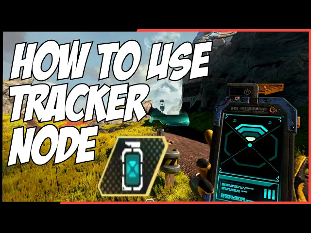
node tracker
Season 17
straight shot
Season 20
quads
Season 21
systems
classes
Season 16
Screen, hud, system, Atomic, Scale
Classes introduced in Season 16 categorize Legends based on their tactical roles in a squad. Each class not only describes a Legend’s combat identity, but also grants a unique passive perk that directly affects gameplay. This rework aimed to clarify roles, improve team composition decision-making, and better align each Legend’s identity with their gameplay function — making team strategy more meaningful and the meta more tactical.
rippling changes
The introduction of Legend Classes in Season 16 redefined Apex Legends’ entire UX and system architecture. It required restructuring how Legends were categorized and how shared abilities like scanning, support crafting, or ring control were handled under unified systems. From a UX perspective, it meant clearly surfacing class identity at every touchpoint—character select, HUD, and team composition screens—through new iconography, color systems, and role descriptions. This shift streamlined onboarding, deepened team strategy, and established a scalable foundation for future Legends and features.


ranked
Season 21
Screen, system, info dump
Since its launch in Season 2, Ranked has undergone multiple evolutions to improve fairness, reduce abuse, and better reflect player skill. With a full overhaul of the match end flow to breakdown and detail all the ways you could gain points and progress your rank.
clarity and transparency
Rank progression is designed for clarity and player awareness across every stage of the experience.
In the Ranked tab, players can easily track their current tier, division, and RP progress through a visible progress bar that shows exactly how far they are from the next promotion or demotion.
The loading screen surfaces a rank distribution preview, showing the tiers of all players in the lobby; setting expectations for match difficulty and grounding players’ sense of competition before the round even begins.
After each match, a detailed end-of-match breakdown explains RP changes, highlighting placement, eliminations, assists, and bonuses, to reinforce how performance directly affects rank.
These layers of feedback combine to keep players oriented, motivated, and aware of both their standing and the skill level of the arena they’re stepping into.


Quads
Season 21
Screen, hud, system, Atomic
Although already mentioned under LTMs, Quads deserves special attention as it pushed us to rethink core UI and HUD systems built around a three-player squad model. Expanding to four players meant re-evaluating layout density, visual hierarchy, and information grouping across the lobby, start flow, in-game HUD, and end-match summary. Elements like squad frames, health tracking, and player callouts needed to remain readable despite reduced screen space. This update became a key UX exercise in scalability and adaptability, ensuring that core systems could gracefully support variable team sizes without compromising clarity or usability.


arsenals
Season 24
Screen, hud, system, Atomic
The introduction of Arsenal Stations gave players guaranteed access to weapons in fixed map locations—with each station offering a cache of guns for a specific ammo type and an enhancing terminal to upgrade one weapon’s attachments.
Intuitive recognizability
From a UX perspective, these new interactable spaces required players to instantly understand their purpose, usability, and location. To achieve this, we leveraged the game’s established ammo iconography—a visual system players already associate with weapon categorization in Apex. Each Arsenal was themed and marked according to its ammo type, creating immediate recognition through consistent shapes and colors, while in-world bannering made their presence clear across the map. This same visual language was reinforced throughout the weapon menus, strengthening the mental link between ammo type and Arsenal functionality, ensuring intuitive understanding through repetition and consistent design across both in-world and UI contexts.


And more…

requeue
Season 20

overhead hp & dmg
Season 22

store
Season 23
